 Foblex Flow
Building AI Low-Code Platform in Angular — Part 3: Creating Custom Nodes and a Node Palette
In the previous article, we built a basic editor with two nodes and a single connection. In this part, we move toward a real Angular node editor by adding custom node components, interactive connectors, and a reusable node palette.
It’s not a full low-code platform just yet, but it establishes the custom-node architecture most teams need before layering on validation, side panels, and richer workflow behavior.
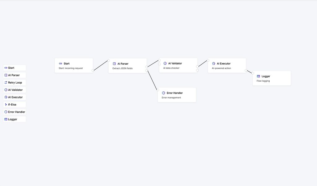
In this part, we’ll implement:
- 🎨 A node palette with icons and labels
- 🧩 Custom Angular components for each node
- 🧵 Connectors (input/output) with interactive hover effects
- 🔌 Logic to create nodes and connections using Foblex Flow events
Version note: The linked repository preserves the original v18 implementation. The examples below use the unified connector and event APIs introduced in v19.
Component Architecture
Our visual flow will be based on three main components:
- Flow — the main Angular component containing <f-flow> and managing all nodes and connections
- Node — a custom Angular component that represents a single node, linked to Foblex Flow using the fNode directive
- FlowPalette — a sidebar panel containing draggable elements for the canvas
Continuing from the Previous Project
We’ll continue building on the project from the previous article.
Add Icons and Reset Styles
First, we need to load the required fonts and icons. Add the following to your index.html:
Then, reset default styles and apply the base font by adding this to your styles.scss:
Defining Node Models and Initial Data
Let’s begin by defining the models for nodes and connections. Below are the TypeScript interfaces and an example set of 8 node types, which you can expand or customize later as needed:
Now let’s define a list of available nodes:
Creating the Node Palette
Next, we’ll create the flow-palette component — a vertical sidebar from which we can drag nodes into the canvas.
Each palette item is a div using the fExternalItem directive, which enables external drag-and-drop support with Foblex Flow.
Template (flow-palette.html)
Styles (flow-palette.scss)
We use ::ng-deep here because drag preview elements are appended to the document.body. Without it, styles wouldn’t apply to them.
Component (flow-palette.ts)
Now we can add nodes from the palette directly into the flow by handling the following event:
📦 Custom Nodes
Each node in the editor will be represented by a dedicated Angular component:
Node Template:
Styles (node.scss):
Each node has target and source ports built with the unified fConnector directive. fConnectorType defines each port’s role, while fConnectorId gives the connection model a stable endpoint.
🔘 Connector Component
While we could have kept the connector inline inside the node, we’re moving it to a standalone component for better style encapsulation and code separation.
Component (connector.ts):
Styles (connector.scss):
🚀 Dynamically Adding Nodes from the Palette
Up to this point, we’ve been rendering nodes manually — statically defined in the template. Now it’s time to take the next step: we’ll enable users to dynamically add nodes by dragging them from the side palette into the canvas.
Here’s how the flow works:
- The user drags a node from the palette.
- The fCreateNode event is triggered, giving us information about what type of node was added and where it should appear.
- We push the new node into a reactive array — and thanks to @for, it immediately appears on the canvas.
1. Storing nodes in a signal
We start by creating a signal to hold the list of all current nodes:
Signals make the UI reactive — whenever the list updates, the DOM reflects the changes.
2. Handling the fCreateNode event
Now let’s define the method that will run when a new node is added:
Here’s what’s happening:
- We extract the node’s metadata from
event.data. - We generate a unique ID using
generateGuid(). - We use
event.externalItemRectfor the dropped item’s position in flow coordinates. event.targetContainerIdidentifies the node or group under the drop, when present.event.dropPositionprovides the exact pointer position when custom placement logic needs it.- We return a new list of nodes with the new one added.
3. Updating the template
Let’s replace the static nodes with a dynamic list rendered using @for:
Key notes:
- fDraggable enables node movement inside the canvas.
- fNode links the element to Foblex Flow.
- fDragHandle defines the draggable area inside the node.
- [fNodePosition], [fNodeId], and [data] pass in the necessary parameters for rendering.
🔁 How the flow comes together
When a user drags a node from flow-palette, the fExternalItem directive fires an fCreateNode event. We handle that event in the createNode method, construct a new node object, and append it to the list. Thanks to @for, the UI instantly reflects the change.
🛠 Generating Unique IDs
To ensure each node has a unique identifier, we use a small utility function:
⚙️ Logic for Creating and Rendering Connections
Now that we can add nodes from the palette, it’s time to implement the next key step: connecting nodes together — and rendering those connections inside the canvas.
🧩 What <f-connection-for-create> Does
This component goes inside <f-canvas> and renders a temporary line when the user starts dragging a connection from an output. It also triggers the fCreateConnection event once the drag ends — either over a valid input or in empty space.
📌 Listening to fCreateConnection and Displaying Connections
Let’s update our Flow component template to handle the connection event and also render all created connections:
🔁 Handling the Connection Event
Here’s the method that handles fCreateConnection and stores the connection in a reactive signal:
Here’s what’s happening:
event.sourceIdis the ID of the source connector the user dragged from.event.targetIdis the target connector ID, orundefinedwhen the pointer is released in empty space.event.dropPositionis the pointer position in flow coordinates and can be used to open a node picker or apply custom drop behavior.
🖇 Putting It All Together
Now we have a complete cycle in place:
- Nodes are added from the palette.
- The user connects outputs to inputs.
- All valid connections are stored in connections() and automatically rendered in the flow via <f-connection>.
🧩 Conclusion
At this stage, our visual editor is starting to look much more like a real low-code platform. We’ve learned how to:
- create custom Angular-based nodes;
- render them inside the canvas;
- drag items from a palette;
- connect nodes visually using interactive connectors;
- store and display the list of all connections.
The key idea in this part is the separation of logic from visual behavior. This implementation uses Foblex Flow's default stateless mode: the library tells you what happened when a node is added, a connection starts, or a drag completes, and the application updates its own signals.
For editors that do not need a separate application store, the optional Managed Flow State plugin can hold typed graph records and apply supported gestures automatically. It does not change the manual event-driven approach shown in this series.
In the next part, we’ll focus on styling and connection behavior. We’ll add curved lines, color schemes, arrows, custom states, and interactions like hover, click, and delete. These enhancements will give your flow editor a polished and professional feel.
🙌 Thanks for Your Interest
If you like the project — leave a ⭐ on GitHub, join the discussions, and share your feedback!